AquaPony user's manual
Table of Contents
Contact : aquapony@lirmm.fr
Date : 2018-12-14
1 Overall process
This page provides a user's guide to AquaPony. We abbreviate AquaPony as AP.
AP is an interactive visualisation tool for phylogenies with ancestral annotations and trait evolution scenarios.
The classical process for visualising a BEAST tree with AquaPony (AP) goes as follows:
- upload a file containing an evolutionary tree with annotation in BEAST/Newick format
- click on "Figure Creation" button to generate the visualisation of the tree (which will automatically appears – see Figure 1)
- choose the annotations that should be visualised on the tree (e.g., as colours or pie charts) from the annotation panel – see Figure 4)
- set up the visualisation options if needed (using the Options panel)
- explore possible evolutionary scenarios on chosen branches of the tree (if needed) – see Figure 12)
- save the images of the tree, of the scenario and of the annotation legends.
Eventually, you may also want to manage (insert, delete) or update the annotation of your initial uploaded tree. There, AP can be used as an annotation management tool.
Vocabulary
For describing the tree visualised with AP
- a trait: a discrete or continuous feature of a taxa; it is stored for a node in an annotation. Ex: the geographical location, the living temperature, the GC content of the genome, etc.
- a state: a value for a trait. For example if the trait is the geographical location: a state could France or Northern Scandinavia.
- a scenario: the evolution of a trait along time. It corresponds to the series of state encountered when reading a branch (from the root until the chosen leaf): for instance, the putative ancestral location for all internal nodes of that branch until the observed location of the leaf taxon.
- an optimal scenario: the most likely scenario inferred from the data (often using the BEAST, or a related, software).
- a suboptimal scenario: the scenario with lower probability for the same branch.
In AquaPony interface, we use
- a field: where you can drag and drop a value, a file, etc.
- a dialog box: a complex field like the one for Min/max disk, when you can for instance enter several values or modify colours.
- a button: to set an option on/off when you click on it.
- a panel: an area of the interface grouping several related fields or dialog boxes, as e.g. the Annotation panel.
2 Upload of tree and figure creation
AP reads the tree file, parses all annotations, and records to which nodes they correspond.
- It prepares the list that is later displayed in the List of annotations, and from which the user can drag and drop any annotation – see Figure 5.
- It numbers all nodes in the tree (including the leaves/taxa) and this number serves as a node identifier. Hence, in the Annotation Table (Figure 6) each node appears together with its identifier and a information icon (Figure 14). This icon makes the link between the node and its position in the tree representation.
- It draws the main tree in the Main tree panel, and displays nothing (yet) in the Subtree panel. See Figure 2.
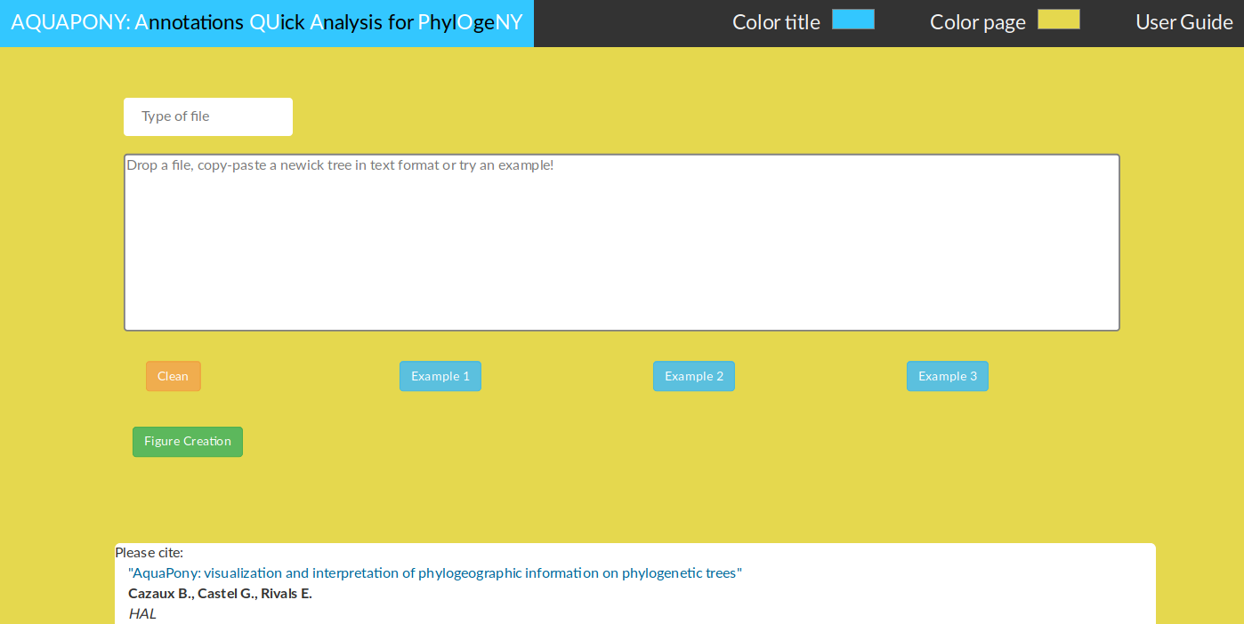
Figure 1: AquaPony front page. The user can drag & drop (or upload) its own tree file. Several examples are provided for testing.
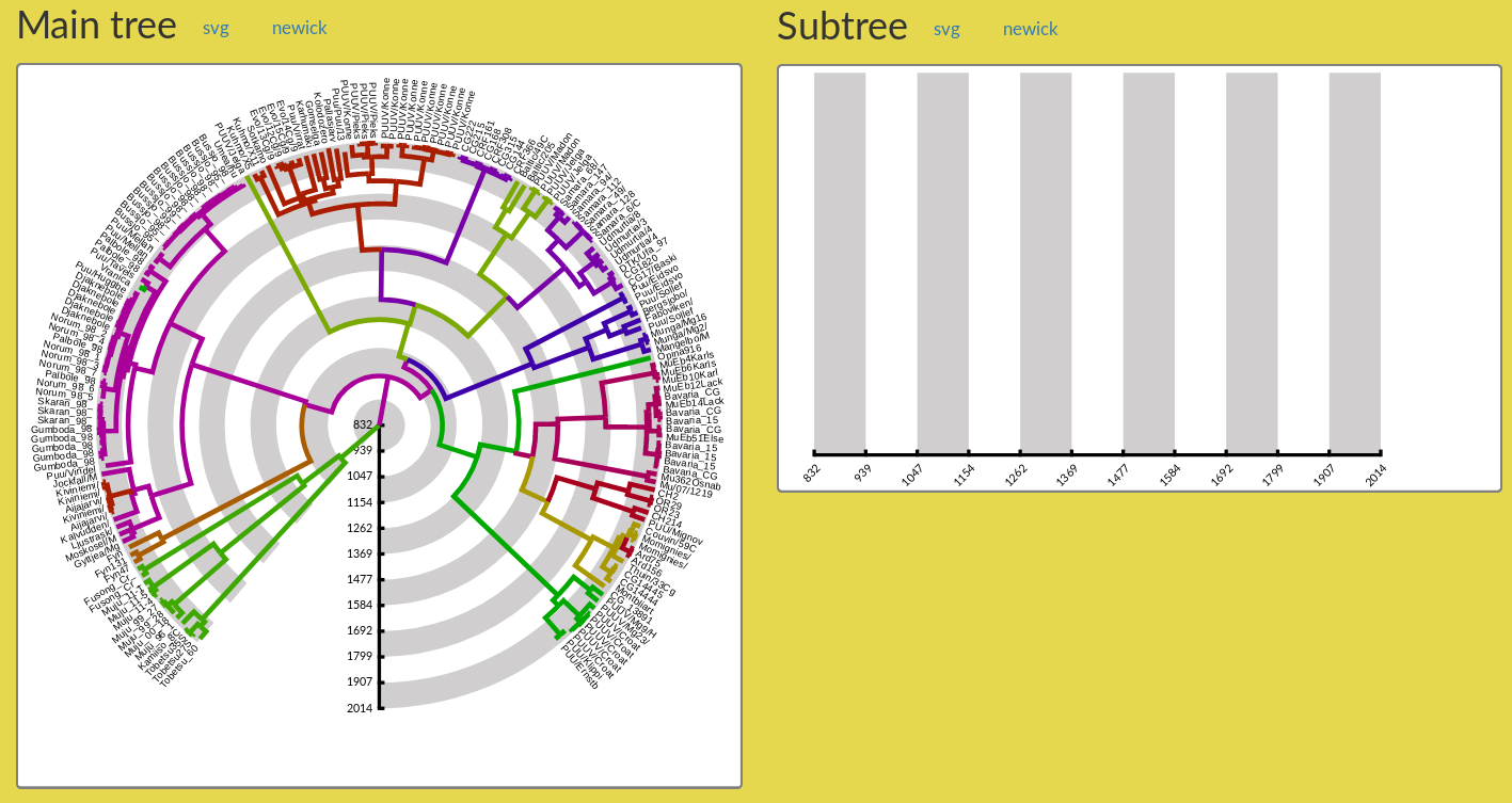
Figure 2: The Main tree and Subtree panels just after figure creation. Only the main tree is displayed in the Main tree panel, and the Subtree panel remains empty. The user must select a subtree to obtain a display in the Subtree panel (see Section 4).
Saving an image from the tree panels, the scenario panels, etc.
AP displays annotated trees and evolutionary scenarios to help you visualise your phylogenetic/phylogeographic data. For each panel, you will find a svg button (Figure 2) to save the image as an image file in vector graphic format, more precisely in Scalable Vector Graphics (see SVG format). This format is ideal for re-scaling your image to the desired size. You can then export it in PNG format using well-known tools like Inkscape.
You will also find svg button next to dialog boxes: they allow you to save an image of the legend (for pie charts or coloured disks).
Similarly, you will choose newick format to save the tree in a file encoded using the universal Newick format.
3 Format
AP accepts currently the BEAST/Newick format, where the recursive rules are
"("+FirstChild,...,LastChild ")" + Name + "[&"+FistAnnotation+":"+ValueFirstAnnotation+","+...+","+LastAnnotation+":"+ValueLastAnnotation+"]"+":"+Distance
If your file is in Nexus, you can extract the BEAST/Newick easily by just taken the string after tree = in the file.
Please find (at the given URL) details on the Nexus format or on the Newick format.
4 Viewing a subtree
The entire tree may be very large. To examine some parts in detail, you can ask AP to display a subtree (with the same annotation as in the main tree). To do so, just right click on the chosen edge of the main tree (Figure 3). This opens a menu (in blue background), and choose the option Select the whole subtree. AP will automatically display the desired subtree in the Subtree panel (as in Figure 11).
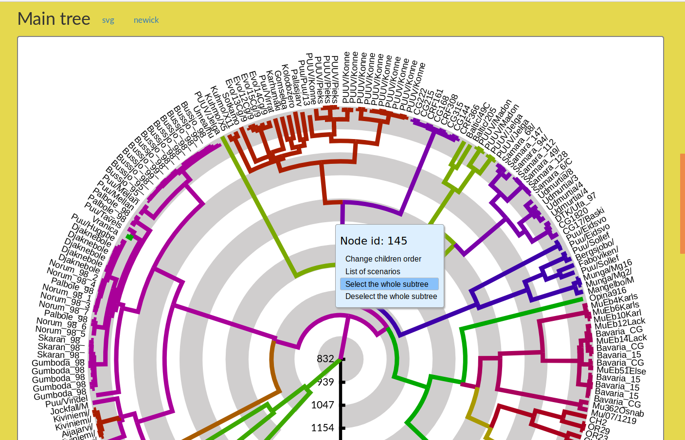
Figure 3: How to select a subtree and ask AP to display it in the Subtree panel.
5 Annotations and colours panel
- Each annotation found is represented by a coloured rectangle
- The colour codes the type of annotation: green: a real/integer number, blue: arrays of numbers/strings, orange: everything else, especially non numerical information like geographic locations.
- A good beast annotation is a set of four annotations which are of this type:
annotation(in orange) which corresponds to the chosen annotation,annotation.prob(in green) which corresponds to the probability of the chosen annotation,annotation.set(in blue) which corresponds to the set of available annotations.annotatio.set.prob(in blue) which corresponds to the set of probabilities of available annotations.
- Information on the branches: drag and drop one annotation (containing a number or a list of strings) on the Branch button (Figure 10). Then AP automatically associates one colour to each value, and colours the branches accordingly (Figure 11 ). Typically, for annotations that have been inferred for internal nodes, that is ancestral annotation, like the geographical location, the corresponding internal branches will be coloured.
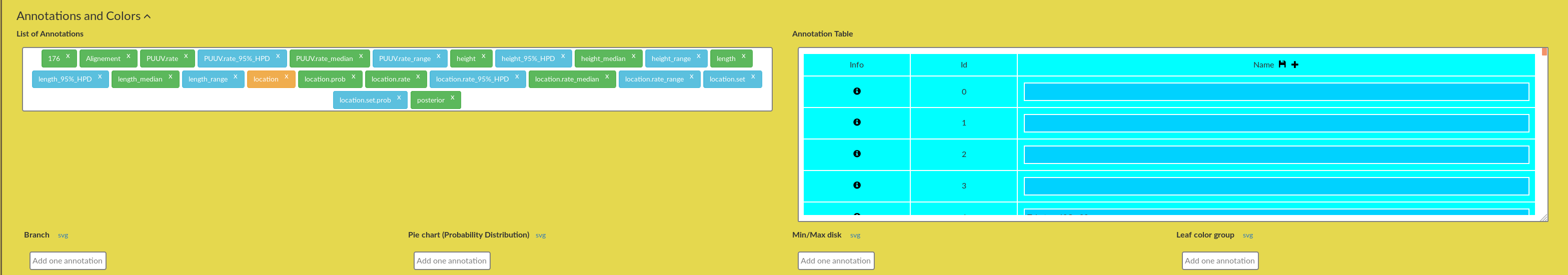
Figure 4: AquaPony Annotation panel.
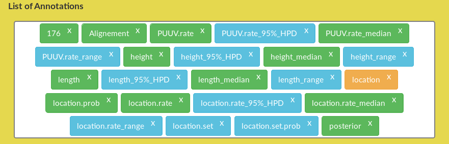
Figure 5: AquaPony Annotation panel: List of Annotations.

Figure 6: AquaPony Annotation panel: Annotation Table.
Visualising uncertainty of annotations
Ancestral states of a trait are usually inferred and are hence uncertain. Several states/values are possible and each is associated with a probability or likelihood. One can consider two typical situations:
- Either one state is much more likely than other possible states, meaning that then there is little uncertainty about the ancestral state,
- or several states/values have similar likelihoods or probabilities, and then one wishes to see which alternative states should be considered to properly interpret the results.
With other tools, it is tedious to find where uncertain states are in the tree. Hence, AP can check the list of states for each edge/node and display either a pie chart or a coloured disk to visualise this uncertainty in the main tree and subtree visualisations. Moreover, AP allows to visualise alternative scenarios for a trait along a branch of the tree (see Section 6).
Uncertainty with coloured disk and/or probability values.
- Drag and drop the desired annotation from the List of annotations on to the Min/max disk field
The trait / annotation appears in the Min/max disk dialog box, with predefined colours and min/max thresholds for both the disk colour and printed probability value. - Update the thresholds to control on which nodes/edges the disk or the probability will be visualised.
The Main tree and Subtree visualisations are automatically updated.
The idea is that "extreme" values are displayed: all values above the max threshold, and all values below the min threshold. The disk is "red" if the value is notably too low (the inferred state less reliable), while the disk is drawn in green if the value is very high (the inferred trait is solid).
To display only the probabilities values (nb) but not the disk (or vice versa), choose threshold values outside the range (a negative value for the min threshold, a value \(> 1\) for the max threshold). An example is shown in Figure 8.
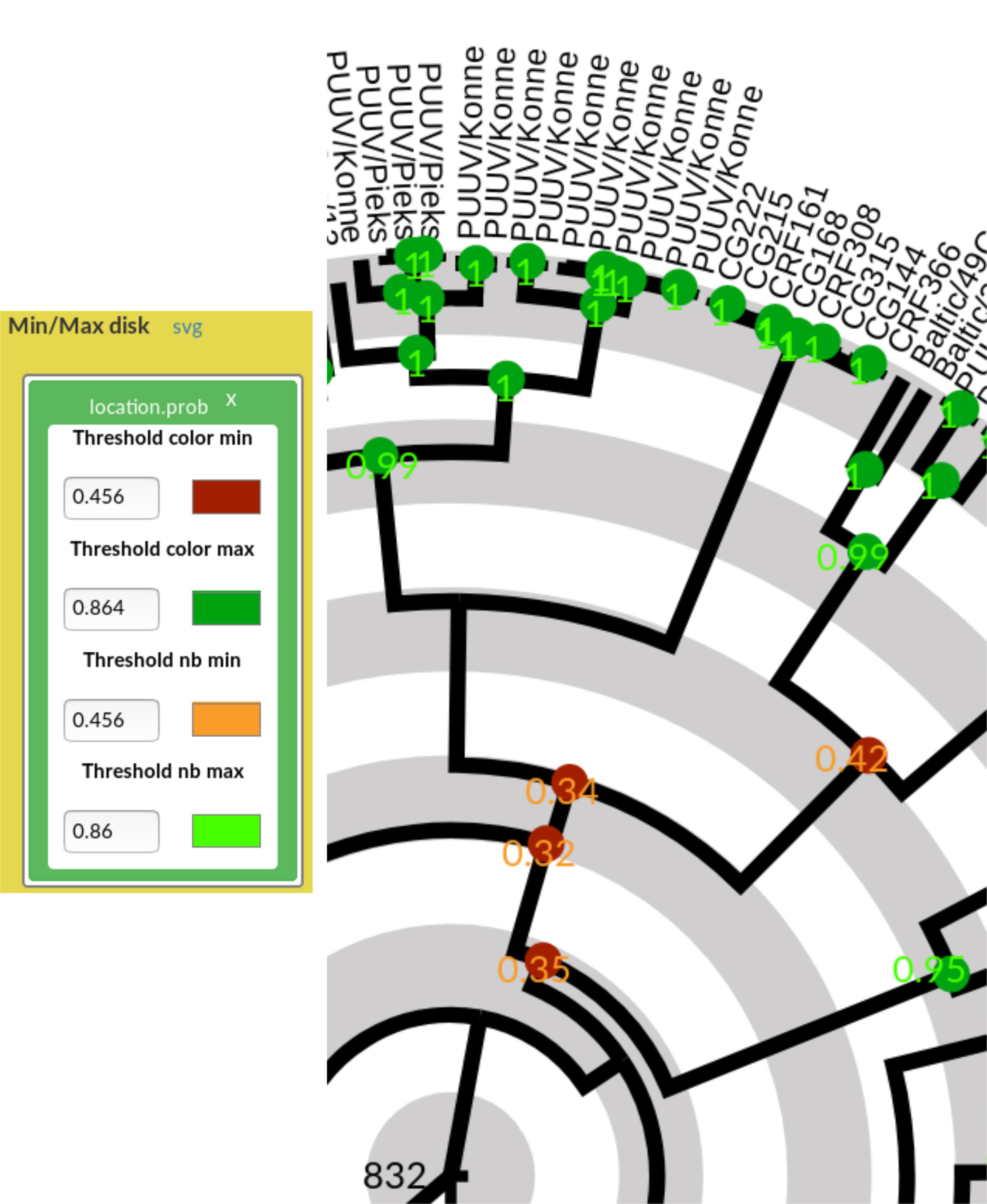
Figure 7: Uncertainty visualisation with disk and values. (Left) Min/max disk dialog box with the location.prob annotation, displaying default thresholds and colours. Both the colours and thresholds can be changed and the tree figures will be updated accordingly. (Right) Effect of Min/max disk visualisation of the location.prob annotation on the tree figures.
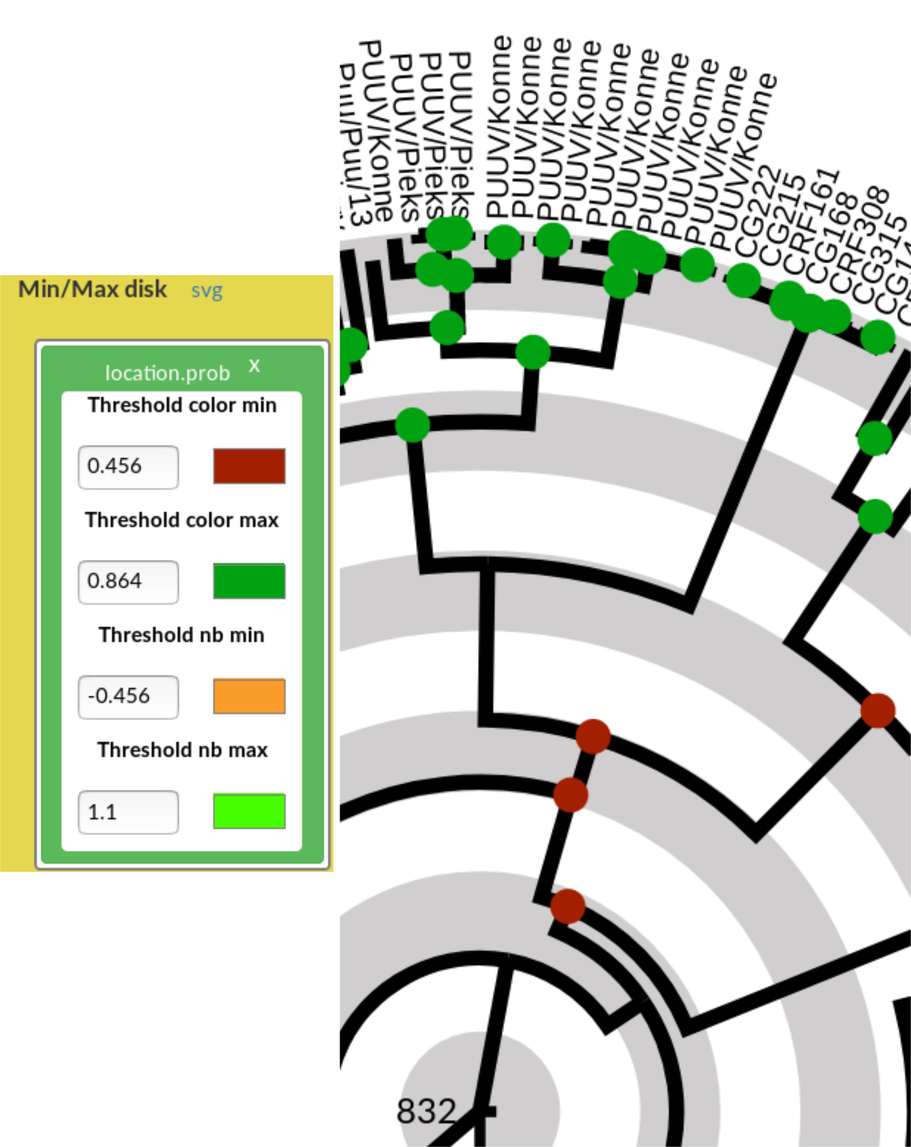
Figure 8: Effects on the tree figures of out of range threshold values for the nb in the Min/max disk. Now, only the disks appear on the tree, but not the probability values (since the thresholds are out of range).
Uncertainty with a pie chart
The Min/max disk helps the user to spot very reliable and very unreliable ancestral states on the tree. However, understanding whether several alternative states are plausible at a given edge cannot be seen with the disk, since only the state with highest probability influences the disk visualisation. To complement this, AP can display a pie chart with one coloured piece for each possible state. The Pie chart offers control for this, and the process is similar to that for the disk:
- Drag and drop the desired annotation from the List of annotations on to the Pie chart field
The trait / annotation appears in the Pie chart dialog box, with predefined colours and min/max thresholds for both the disk colour and printed probability value (Figure 9 - Left). - Update the thresholds to control on which nodes/edges the disk or the probability will be visualised (Figure 9 - Right).
The Main tree and Subtree drawings are automatically updated. In a pie chart, the piece is proportional to the probability: the more likely one state is, the larger the associated coloured piece is.
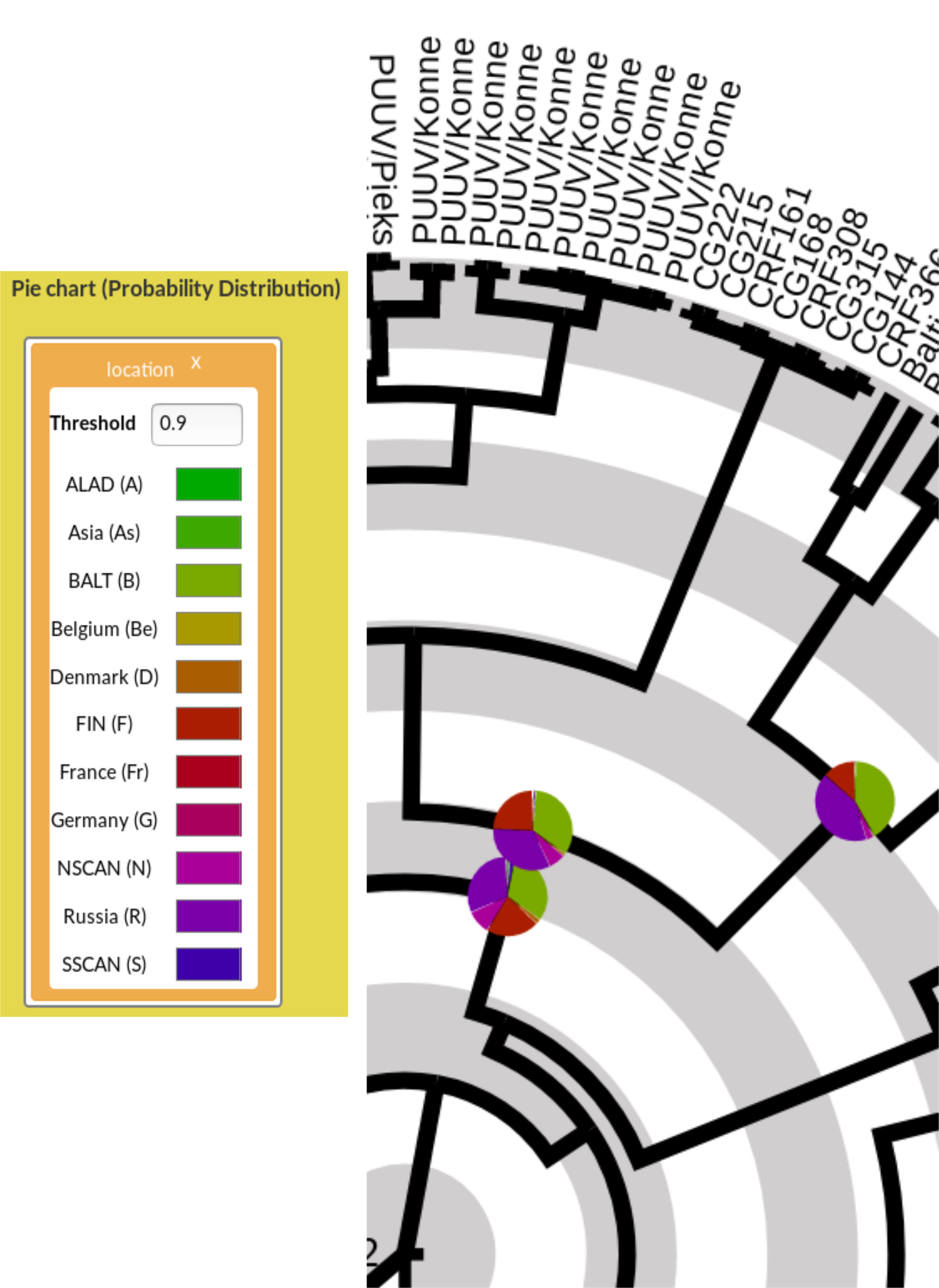
Figure 9: Uncertainty visualisation with pie charts. (Left) Pie chart dialog box with the location annotation, displaying the default threshold and the list of values (here, a geographical location) with their associated colour. (Right) Effect of Pie chart visualisation of the location annotation on the tree figures. On the rightmost pie chart, two colours (green and dark magenta) occupy each circa 40% of the pie, meaning that those two states are almost equiprobable, with the red piece being the third most likely one.
Colour visualisation of an ancestral trait along a branch
Simply drag and drop an annotation from the List of annotations on to the Branch field; AP associates a colour to each value (Figure 10), makes the legend and colour the branches of the tree visualisations of the Main tree and Subtree. In the example of Figure 11, the geographical location is displayed.

Figure 10: Branch field with the location annotation, displaying the list of geographical locations with their associated colour.
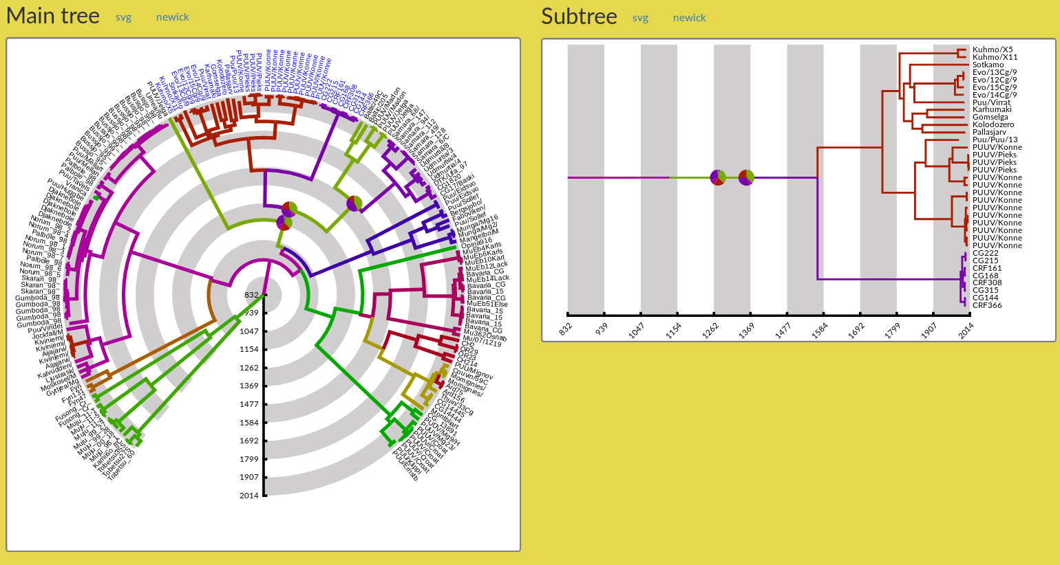
Figure 11: Tree figures with branches coloured according to the geographical location annotation and coloured pie charts.
6 Exploring alternative scenarios
Again, consider the trait of the geographical location, which has been inferred using the BEAST software for internal nodes of the tree. The user can spot which internal nodes have uncertain location using pie charts, for instance. To interpret how the migration or the dissemination has taken place along time, the user may wish to visualise plausible scenarios. AP provides a special, optional panel for this sake: the Scenario panel, which help comparing two scenarios: the optimal one with a user-selected scenario.
In the Main tree, select an edge/node by right clicking on the edge, which opens a menu, and choose the option List of Scenarios. This opens the Scenario panel, and displays in it twice the optimal scenario from the root of the tree until the leaves of the edge's subtree (Figure 12). Below the scenarios appears the time scale, and above it appear alternative locations with their respective probabilities. The list of alternative locations depends on the probability threshold entered in the Max probability box: lowering the threshold will display more alternative locations for each node. The user-selected scenario corresponds to the series of locations highlighted in turquoise colour (initially, it is the optimal scenario). Right next to each scenario appears its total score, which combines the score of all its nodes using the score function that is shown in the field below Select score option.
Alternative scoring functions can be selected by the user in this rolling menu field. The formula displayed right next to it is updated, as well as the scenarios' scores
The user can click on the other locations to display any suboptimal scenario as the second scenario. The chosen locations will be highlighted in turquoise. See an example in Figure 13.
In a scenario, transitions between distinct geographical locations are indicated by horizontal black arrows. Logically, the arrow points towards recent times.
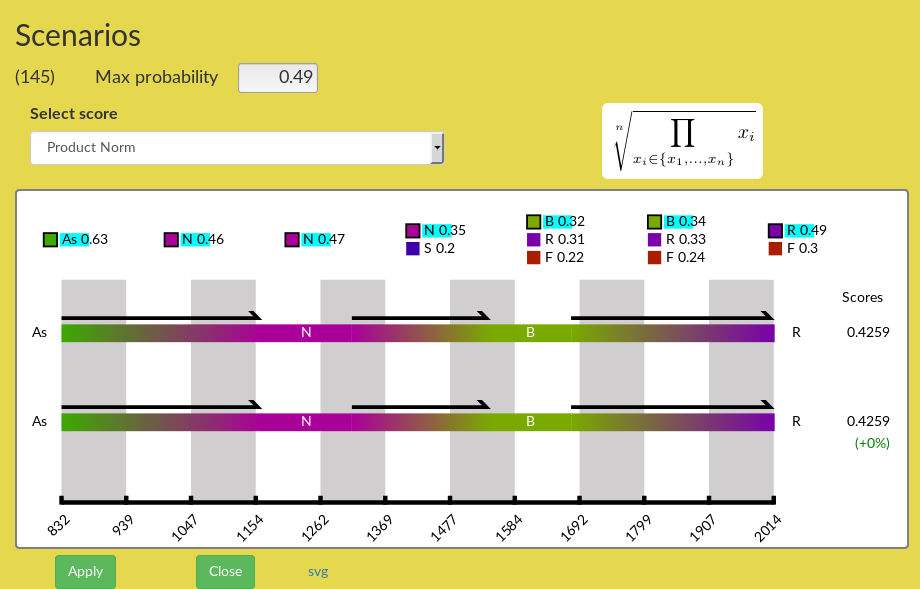
Figure 12: Scenario panel just after opening. The two displayed scenarios are identical at start.
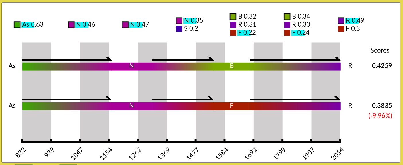
Figure 13: Scenario panel after selection of alternative geographical locations to display a suboptimal scenario. After lowering the threshold at \(0.49\) (instead of \(0.9\) – the default), alternative nodes appear. Clicking on some of alternative locations updates the suboptimal scenario. The score of the suboptimal scenario is recomputed and its difference with the optimal score is shown in parenthesis.
Above the display box the user can select the scoring function, and set the probability threshold above which alternative locations are listed in the panel. Lowering the threshold enables you to increase the list of state values (here, of locations).
Scoring functions for scenarios
The scoring function is used to compute a score for a scenario along a given branch (from the root to a given leaf). It combines the score of all nodes of that branch to compute the score of a scenario. To our knowledge, there is no standard function for this sake in the literature (to our knowledge). Hence, we propose four alternatives that are listed in the Table below.
The variables \(x_1, \ldots, x_i, \ldots, x_n\) represent the scores of each the \(n\) nodes of the selected branch.
| Function | Formula |
|---|---|
| Product | 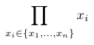 |
| Product norm | 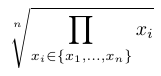 |
| Average diff. | 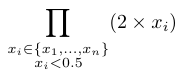 |
| Average diff. norm | 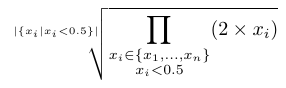 |
| Average | 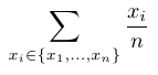 |
7 Managing annotations
Within the Annotation Table, you can view, update, save, download any annotation and even create new ones.
To view an annotation, simply drag and drop the chosen annotation from the List of annotations to the Annotation Table.
The possibilities for updating, saving, downloading or creating annotations are summarised in Figure 14.
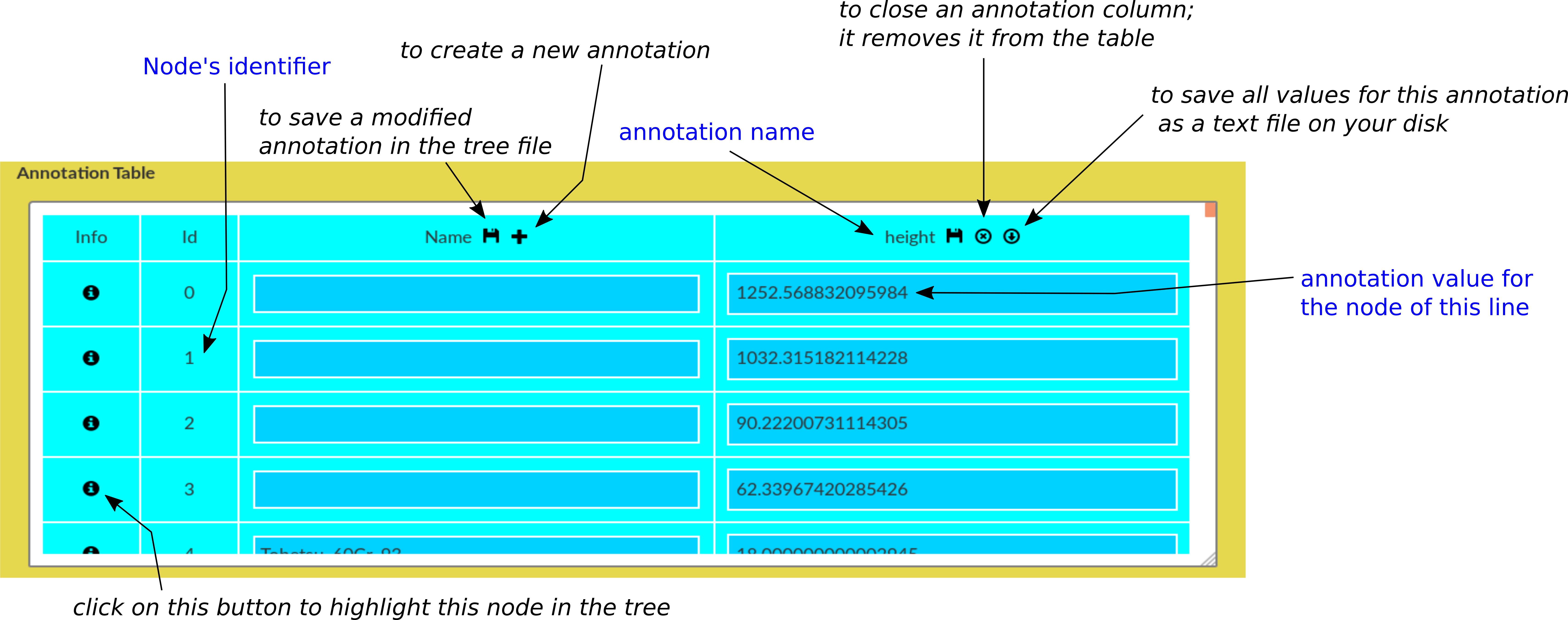
Figure 14: View of the Annotation Table with explanation of icons and management features.
8 Contact, reference, and links.
Contact
For comments, support, feedback, requests, etc., please email aquapony@lirmm.fr with your name, contact address.
If you wish to be informed about new releases: please send email to sympa@lirmm.fr with a single line:
SUB aquapony-users your-name
and remove any signature.
Article
AquaPony: visualization and interpretation of phylogeographic information on phylogenetic trees
B. Cazaux, G. Castel, E. Rivals
HAL lirmm-01702654v1, Feb. 2018.
Links
Inference tool
Currently, the input format of the tree file is that output by the software BEAST. The reference for BEAST is
Drummond AJ, Suchard MA, Xie D, Rambaut A. 2012. Bayesian phylogenetics with BEAUti and the BEAST 1.7. Mol Biol Evol. 29(8):1969–1973.
Alternative tools exist: a list on wikipedia.
Example trees
The first example tree concerns Puumala viruses and is provided by Guillaume Castel.
The second example tree concerns Dengue viruses and stems from the following study:
Walimbe AM, Lotankar M, Cecilia D, Cherian SS. 2014. Global phylogeography of Dengue type 1 and 2 viruses reveals the role of India. Infection, Genetics and Evolution 22 30-39
The third one is a tiny, toy tree (just here for playing, no meaning).
Other visualisation tools: List
Support
![]()
Figure 15: Current support for hosting and maintaining AquaPony is from the ATGC bioinformatics platform.

Figure 16: Supports for the original research and development of AquaPony